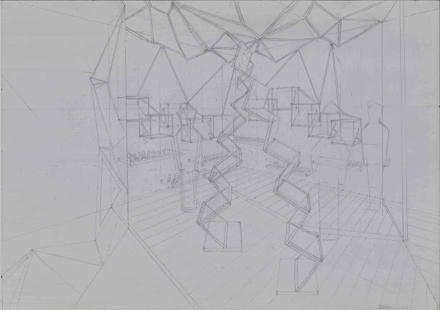
DESIGN DISPLAY AREA PERSPECTIVE VIEW
.jpg) |
| DRAFT |
.jpg) |
| FINAL |
RENDERING
It is almost end of sem.
Here comes our final assignment.
In Design 02 class, we have designed a traditional game boutique otutlet.
For our design communication final assignment,
We are required to choose 2 views from the floor plan we design in Design 02 class.
After that, we have to draw a 2 point perspective on A3 cartridge paper.
Finish drafting on A3 cartridge, I have to trace on tracing paper.
Then print it on normal paper.
Finally, to render it.
This view is my display area.
The boutique I design is selling chinese chess.
The media I use is marker and colour pencil.
This time, I remember the advice my lecturer have given me on last rendering assignment.
"Apply more layer "
I try to apply layer by layer.
Making them look more 3D with shadow.
It does look nicer with more layer
=)
So amazing.
I like my rendering of the timber floor.
My lecturer taught us,
leaving some gap during drawing the stroke with marker,
can have shiny surface texture.
I have applied it on my timber floor.
It does look shiny
haha
Starting to love marker rendering
Just a few stroke, with colour pencil touch up,
comes the wonderful art work~
Another view is a Mini gallery in the shop
MINI GALLERY
.jpg) |
| DRAFT |
.jpg) |
| FINAL |
 |
| RENDERING |
From creating a draft, then tracing, and comes the rendering part.
Overall, my rendering shows my effort.
But, the human figure sketching need to be improved.
Got B+for both work
=)


No comments:
Post a Comment