About Me

My photo
UCSI INTERIOR ARCHITECTURE 2013 JAN INTAKE DEGREE STUDENT- - - - - - - - - - - An ordinary girl, wish to have simple but meaningful life~

Friday, November 8, 2013

DESIGN FINAL PRESENTATION

PRESENTATION BOARD


Through out the whole sem,
What we have learnt in design communication class,
all are applied on this board.

Drawing plan, section, perspective.
Rendering.
Presentation board design.

During my review, I have met my dcomm lecturer as panel.
I have not performed well enough for this 8 A2 presentation boards.
My lecturer has given me a lot of advice.
I have noted all of my mistake.

Still a long way to go, to improve myself.
The coming Sems will be tougher and tougher.
But I am sure that I will grow stronger too!

Let's do it better next sem!!
Yeah~

Thursday, November 7, 2013

ASSIGNMENT 4.4 - RENDERING PERSPECTIVE 2

DESIGN DISPLAY AREA PERSPECTIVE VIEW
DRAFT

FINAL

RENDERING

It is almost end of sem.
Here comes our final assignment.

In Design 02 class, we have designed a traditional game boutique otutlet.
For our design communication final assignment,
We are required to choose 2 views from the floor plan we design in Design 02 class.
After that, we have to draw a 2 point perspective on A3 cartridge paper.
Finish drafting on A3 cartridge, I have to trace on tracing paper.
Then print it on normal paper.
Finally, to render it.

This view is my display area.
The boutique I design is selling chinese chess.

The media I use is marker and colour pencil.
This time, I remember the advice my lecturer have given me on last rendering assignment.
"Apply more layer "
I try to apply layer by layer.
Making them look more 3D with shadow.
It does look nicer with more layer
=)
So amazing.

I like my rendering of the timber floor.
My lecturer taught us,
leaving some gap during drawing the stroke with marker,
can have shiny surface texture.
I have applied it on my timber floor.
It does look shiny
haha
Starting to love marker rendering
Just a few stroke, with colour pencil touch up,
comes the wonderful art work~

Another view is a Mini gallery in the shop
MINI GALLERY
DRAFT

FINAL

RENDERING
Same procedure as producing the display area view.
From creating a draft, then tracing, and comes the rendering part.

Overall, my rendering shows my effort.
But, the human figure sketching need to be improved.
Got B+for both work
=)


Tuesday, November 5, 2013

ASSIGNMENT 4.4 - RENDERING PERSPECTIVES

INTERIOR PERSPECTIVE

This assignment task is to use one point perspective method,
design a space on A3 cartridge paper and then render it with colour pencil.
We can create a housing space or a gallery.

I have chosen to design a gallery.
A furniture and art gallery.
I have got a B for it.

My colour scheme is black and red.
My lecturer said that I have used a striking colour.
 The reason I am having a darker colour as background,
is because my exhibit will be in very sharp colour.
With a dark background, the exhibits can be outstanding in the space 
with the lighting shooting on them.

Maybe the colourful exhibit makes my lecturer feel that 
I have not control my colour scheme.
What I am trying to do is creating a fun gallery with colourful furniture.
The red colour window frame is to highlight the frame as a photo frame, 
showing the view out of it like a painting.


ASSIGNMENT 4.3 - STORY BOARD SKETCHING

STORY BOARD
DRAFT
Based on the same floor plan,
 I have to choose 6 view in the studio to draw 2 point perspective drawing.
From doing it on A3 turn into doing it in a small box.
Seriously, I feel trapped.
Suddenly don't know how to start it.
My friends and I have asked senior for help.
Finally, I got the direction to do it with some tips from senior.

FINAL
After completing the draft,
I have to trace it on tracing paper~
With addition of human figure, arrow and some description about the space I draw.
As you can see, my description words is in different size and thickness.

While I am writing my description,
My lecturer has given me some advice.
She told me that I can use  words in different size  to highlight keywords.
It will make my work looks more interesting too.

If you noticed,
One of my human figure looks so awkward.
(human figure in second box)
Haha...I was laughing at it after I draw it.
It looks like an alien more than a human.
Really need more practice in human figure sketches.
hahaha


Since we have learnt rendering,
of course the story board will not miss it too~
I have to use marker to render my 6 perspective drawings.
Colour pencil is used to touch up my work.

Before rendering, 
I have to think what colour scheme I would like to apply for my Artist Studio.
As you can see, my drawing is in pink and purple.
Haha...
I like this piece of work so much.
It's in my favourite colour.

This time, I have rendered it much more faster than the first time
 when I am doing the orthographic presentation.
I don't feel hesitant.
I have caught some of the technique of using marker.

But still, it is not good enough yet.
The shadow is not enough, I should apply more layer to make it obvious.
 I am still not dare to make it darker.
Got a B+ for it.
Still need to improve a lot on my stroke.


Monday, November 4, 2013

ASSIGNMENT 4.2 - SKETCHING (EXTERIOR)

In-class exercise
 
SKETCHING HUMAN FIGURE AND PLANTS

After sketching furniture, we learn to sketch tress and human figure.

My lecturer showed us how to draw a proper human figure.
It's a relaxing exercise.
We have to draw 5 tress and 5 human figure~

When I wanted to start my drawing, I actually don't have idea how to draw tree.
Tree drawing? Haha, what I remember is my childhood.
How we draw trees? 
The very cute one, just a few turning curve will do.

Now I am going to sketch trees which looks professional.
I have done some searching on internet.
I started by following tree sketches I found online.
Then slowly, I get the touch, and I draw it with my own feel.

Finally done sketching, and now it's time for RENDERING!!
Haha~ my favourite part.
I like the mix colour of green and yellow.
 They always look nice.
I was in a good mood when I was doing my rendering.
Till I forgot about the submission time.
So end up that I have to stay back to finish my work.

I have got an A for it.
So in this exercise,
I have learnt a new way to draw cloud.
A very fun way.
Easy and nice.
I have learnt how to sketch trees.
A professional looking trees.
and 
I have learnt how to sketch human figure.
I need more practise on it.
Haha...
Still haven't find the touch of sketching it.


ASSIGNMENT 4.1 - SKETCHING (INTERIOR COMPONENT)

In-class exercise~

SKETCHING INTERIOR PHYSICAL COMPONENT

I have been doing technical drawing for almost half of my sem.
Here comes sketching assignment
^ ~ ^

During this lecture, we are required to do free hand sketching.
Haha...
Looks fun and relax~
Compared to those technical drawing
 x)

So I have to find pictures of 9 chairs and sketch them.
To sketch the chairs, I have to draw a construction line for it.
Those construction lines are usually a geometry form.
Like cube, cuboid, pyramid, cone etc.
After sketching the outline of chair, I have to use different colour to render my work.
Shadow is needed to make the sketches look alive.

This kind of sketching work reminds me about my foundation studies.
We have done a lot of sketches during our architecture foundation studies.
It is much more easier now for me to sketch.

I like to render my work with cross-hatching.
It takes a lot of time, but it looks nice.
Got an A for it.

Bring home exercise

After sketching chairs, we are going to sketch 9 tables as bring home assignment.
Same like the previous sketching, 
I have to find 9 tables to sketch them then render them.

Table is less fun than chair as the shape of it is not as various as chair.
But still, I enjoy it.

One of my table looks distorted.
(table in dark brown)
Yaiks, mark deducted. haha
Got a B+ for it.


ASSIGNMENT 3 - MODEL MAKING PRESENTATION AND PHOTOGRAPHY

After doing the Presentation Drawing, we are going to do a model base on the same floor plan

MODEL MAKING
Model making have two type.
One type is study model which is not that detail, it is use for studying the space.
Another type is with all the detail, especially the furniture in the space, need to be shown.

The model I built for this assignment is not a study model.
It is a model which I have to show all the details especially the furniture.
I have to build out all the furniture in the artist studio model.
I have learnt some ways to cut modelling board in this assignment from my lecturer.

The model should look neat and nice.
So I have to take care my workmanship during doing it.
It takes me around 2 days to complete it.

After building the model, I have to learn photographing.
I learn how to adjust the setting of DSLR camera.
My classmates and I have to go my school's science lab to take photos.
We have to take 1 elevation, 1 plan, 1 perspective and 2 detail.

After taking photos, we have to proceed to Presentation board design.

PRESENTATION BOARD DESIGN

So this is my design.
I am using black and white, to create formal style.
But seems like I didn't really success.

My lecturer comment that
I should try with more colours, rather than just black and white.
Maybe some colour graphic for background.
And my graphic shape is not that tidy.
The 2 photos below are lack of camera focus.
I got a B for it.

Well, I have to practise more on how to design my presentation boards.


Saturday, November 2, 2013

ASSIGNMENT 2.4 - ORTHOGRAPHIC PROJECTION (PRESENTATION DRAWING)

In-class exercise

PRESENTATION DRAWING & COLOUR SCHEME

Wow, we are going to explore using marker for this assignment.
Haha...
I have heard that this marker is a easy and fast rendering equipment if you know it well.

For this assignment, we are going to learn how to present our work.
We have to learn how to organise our drawing, title, description etc on a given size paper.
We are required to organise a Ground Floor Plan, Section, Title, Subtitle and a description 
on A3 marker paper.
I have to photocopy my previous Orthographic Projection Drawing which is 
my Ground Floor Plan and Section.
Arrange them .
Then trace them on marker paper.

After tracing, we are required to write some description about our artist studio.
Haha...
I have named the owner of this house as Mr Franpo.
Looks so professional ?! hahaha...
FRANPO STUDIO

After everything is done, my lecturer demo how to render our work with marker.
When I look at it, the rendering looks easy.
After the demo, I am so excited to have a try.

But, when it is my turn to do it on my paper, I hesitated.
I went to photocopy my original drawing to practise, since this is my first time.
If I straight away render on the only copy I have, I will have to redraw everything.

With a few copies of drawing, I don't feel that hesitant any more.
I keep on trying the colour of marker on the draft copies.
Finally, I get some feel of rendering it xD
But it's time to dismiss
I am lacking of marker actually...
Luckily my friends are so kind.
They are willing to share their marker with me.

So after my dinner, I went to our studio and complete this assignment with my friend.
We share the experience of using marker the first time.
It's hard to control the marker, if we didn't use it carefully, it will smudge and ruin our work.
The marker is driving my friends and I crazy actually.
Haha...But it is a good experience
I have had so much fun.

Finally, the outcome~
I get 7/10
Comment of lecturer is
Sketches technique is good.
but
I didn't label the space in my plan drawing.
And my subtitle's orientation need to be reconsider to highlight in the drawing.
I have to determine the colour scheme too.
owh...quite a lot of mistake
But it's ok~
Will do it better next time!!


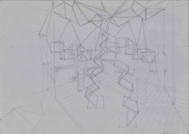


ASSIGNMENT 2.3 - TWO POINT PERSPECTIVE DRAWING

In- class exercise
Before this class, lecturer has required us to search photos of two point perspective.
We have to print it out in A3 and find the VP.

TWO POINT PERSPECTIVE
 (PHOTOGRAPH METHOD)
Photo searched
Traced drawing

After I found the VP, I have to trace the photograph on A3 cartridge paper.
I have to use different thickness felt tip pen to trace the drawing.

I have used the thickest pen to show the shading.

After adding the shading, the drawing looks so nice.
It shows 3D effect.
Like it so much.
I enjoy doing it.

Got an A for it
x)

Another same type of assignment with different photo, but it is a bring home exercise.
Photo Searched

Traced Drawing

For this assignment, my lines are not firm enough.
Got a bit shaky.
So I got a B+


Friday, November 1, 2013

ASSIGNMENT 2.2 TWO POINT PERSPECTIVES (MP METHOD)

After Exploded Drawing, I am going to learn Two Point Perspective Drawing with Measuring Point Method (MP METHOD)

TWO POINT PERSPECTIVE
 (ESTIMATING LINE METHOD WITH DRAFT)

There are few steps to follow for producing a 2 point perspective drawing
1. Determine the Ground Line.
2. Determine the Horizontal Line (eye level).
3. Determine the 2 Vanishing points (VP).
4. Determine the angle of the view by indicating a point A.
5. Determine the width and length from the Point A on Ground Line. Create grid with scale ruler.
6. Project lines from the 2 VP to Point A on Ground Line.
7. Determine the 2 Single Vanishing Points (SVP). Project lines from the point to the grid created on Ground Line.
8. Create a base grid by projecting lines from Vanishing Point to the intersection point between SVP projected line to Ground Line and the projected line from 2 VP to Point A.
 9. Determine the height of space from Point A. Draw the box of the space.

After drawing out the base grid lines and the box,
 I can use the grid line which is in scale to draw my interior furniture and so on.

My lecturer give us advice to use different colour for the projecting lines from different point.
 It will be easier for us to differentiate them.

I found it interesting when I am doing this assignment.
Just with some easy steps,
a two point space is created.
I have done a great job for the draft.

After completing the draft, I have to print it in a larger scale and trace it on tracing paper.


On the tracing paper, I have to add more details for example the furniture texture, lighting and so on.
I have to make the space looks interesting.
But seems like I have failed to do so.
I like my wall texture actually. I used a lot of time for it.
I didn't add texture for my sofa because it looks nicer in this plain texture rather than with a texture.

But work's line quality is bad.
I did it in a hurry.
So I have a lot of mistakes.
I got 6/10.

It's ok. I can do better next time.
yeah~ ^^
Keep moving forward!!